
Reach
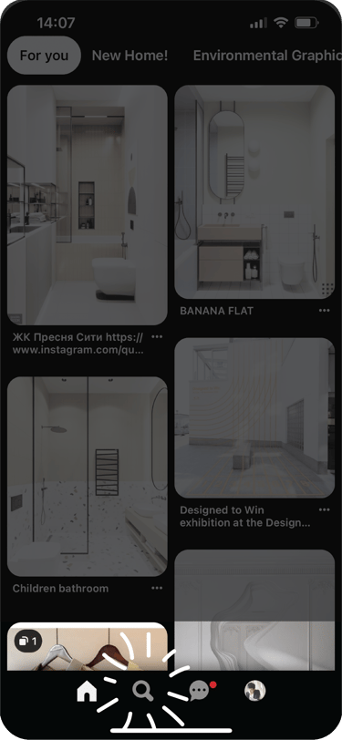
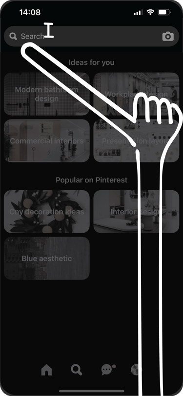
Pinterest's redesign is largely well-done, except for one key part — search.
UIUXDIGITAL
Samuel Lim
1 min read
I wonder if Pinterest users browse their feed like users do on TikTok? Is it just me who goes to Pinterest with keywords and search goals in mind?


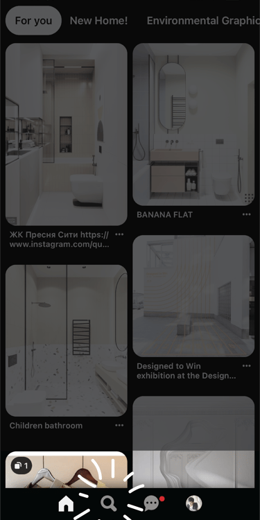
Navigation bar is well-placed and reachable,
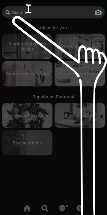
Until the search field is placed all the way at the top.


What I think:
The inconsistency and reachability issue is a pain. We need to stop designing products like we're writing a book. The top down layout should not be default for all mediums, context matters too.
What I might do:
Depending on the goal of the team (what behaviour they want to encourage), and research findings (on common user behaviour), I may just bring up the keyboard when the search key is tapped. But if the team wants to promote topic discovery instead of direct typing to search, I would bring the search field down, right above the navigation bar on the search page. Giving users a choice to use both methods easily. The field can be dismissed when users start scrolling to view more topics.
