

Tech Needs Design
Technology can't reach users without design.
UIUXDIGITAL
Samuel Lim
3 min read
Singapore introduced a unified contactless transit card (EZ Link) in 2002. Since then, snaking queues to top up (reload) the cards have been a common sight.
A plethora of solutions to alleviate this issue were introduced over the last 20 years. From enabling top up at local ATMs (which only shifted the queue from one machine to another) to auto top up directly debited from your bank account. They even sold USB card readers, for top up at home.
Transport for London has a brilliant solution that enables you to remotely top up the Oyster through an app. The value will be credited to the card upon touching the reader at faregates when entering/exiting the station. This reduces the need for a dedicated machine just to add-value and enables you to top up on-the-go. This innovation has never reached Singapore.
Behold, Advanced Technology
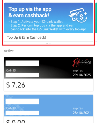
What Singapore's EZ Link has instead is an app. Commuters can simply tap the card via NFC to top up using their phones. It’s amazing when it works because what used to require a huge machine is now possible in our hands. I’ve since shown that feature to my family and friends and would always get the same ‘wow’. But hardly anyone knows about this because this app tries to do a lot at once, and it lacks focus. Beyond issues on comms materials, I think the app UI can be improved.
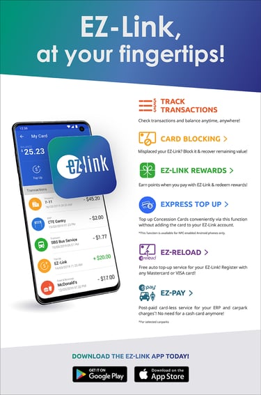
Features highlighted on the official poster (Source: EZ-Link)
1. Track transactions
2. Card Blocking
3. EZ-Link Rewards
4. Express Top Up (Kind of missed the chance to call it EZ-Top Up?)
5. EZ-Reload (What’s the difference between this and Express Top Up?)
6. EZ-Pay (??)
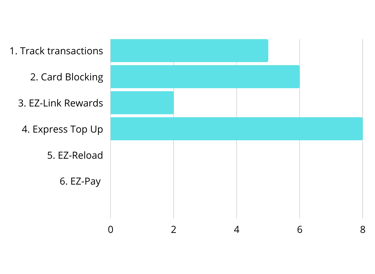
I think Express Top Up is awesome, but is it just me?
What's one feature worth downloading the app for?
I conducted a quick poll with 10 users of EZ-Link to get a sense.

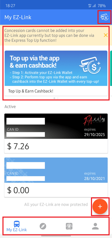
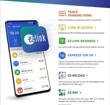
This is the app homescreen, which lacks focus.
I would assume the team knew their ‘star feature’ was Express Top Up. Given how there are two banners added to publicise the feature. Yet the icon to top up is poorly placed at the top right corner.
To make matters worse, there’s an orange ‘+’ symbol seemingly to signal top up, when in fact it is for users to add a new cards. How often do they expect users to add new transit cards to their account?
Be mindful of the app’s identity, it is the brand and storefront
Apps have been playing an important role for brands to maintain a touchpoint with consumers. It maintains brand association and enables product discovery. Good UI/UX design remains critical for businesses today, and it covers both physical to digital spaces.
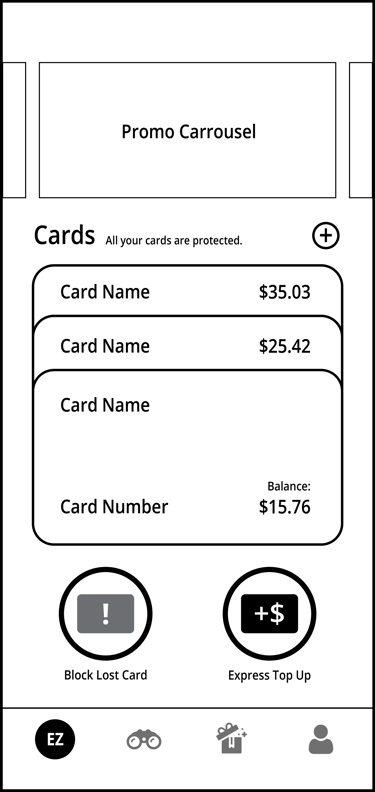
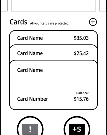
Proposed Homescreen Wireframe
1. Cards stacked to save space, keeping crucial information visible.
2. Two key features (Block lost card & Express top up) prominent and reachable.
3. Menu icons with clearer intent and features EZ-Link logo.