

The Right Click
Microsoft's right-click menu is a disaster waiting to happen.
UIUXDIGITAL
Samuel Lim
1 min read
Microsoft’s right-click menu is a disaster waiting to happen.
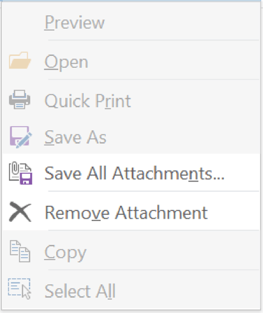
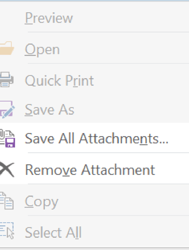
Saving attachments and removing attachments from an email is not an “either-or choice”. To download the attachment, or do nothing to it, or to delete it. So ignoring the neutral choice and placing the either ends side-by-side is poor design. Factoring user error, the cost of clicking the wrong option is too high to place such drastic choices right next to each other.
Example 1 Outlook:
Saving all attachments
VS Deleting them
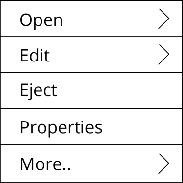
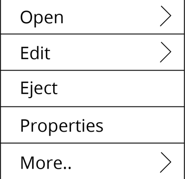
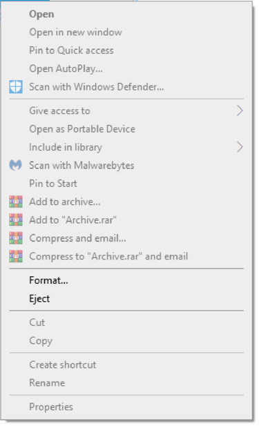
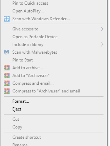
Example 2 Windows:
Ejecting a drive
VS Formatting it
What I suggest:
Lead users to the right choice through choice architecture.
Reducing number of clicks is a good practice, but striking a balance is more important.
Limiting choices help reduce chances of error - which may help users get the job done faster, with less frustration, and potentially saving on unnecessary clicks. So grouping related choices and having sub-menus could potentially be less confusing for users.